 en
en  lt
lt 
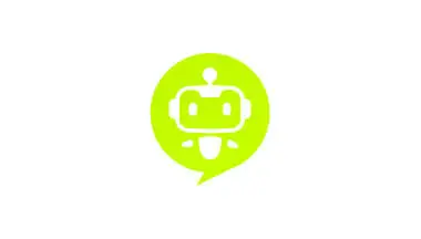
Primary Logo - green icon
Download Logo
Tommy.lt is on a mission to become your digital memory. By integrating secure AI tools into daily life and workflows, Tommy empowers users to effortlessly find, organize, and interact with the information they need — whether at work, on a project, or with family.
We believe AI should feel natural, safe, and helpful — not overwhelming. Tommy works for you and with you.
Tommy is a smart, AI-powered assistant designed to help individuals and teams manage information overload in both work and family life. The brand name “Tommy” is approachable, human-like, and easy to remember — evoking trust and everyday utility. The “.lt” domain reflects its Lithuanian roots while maintaining a modern, tech-forward presence.
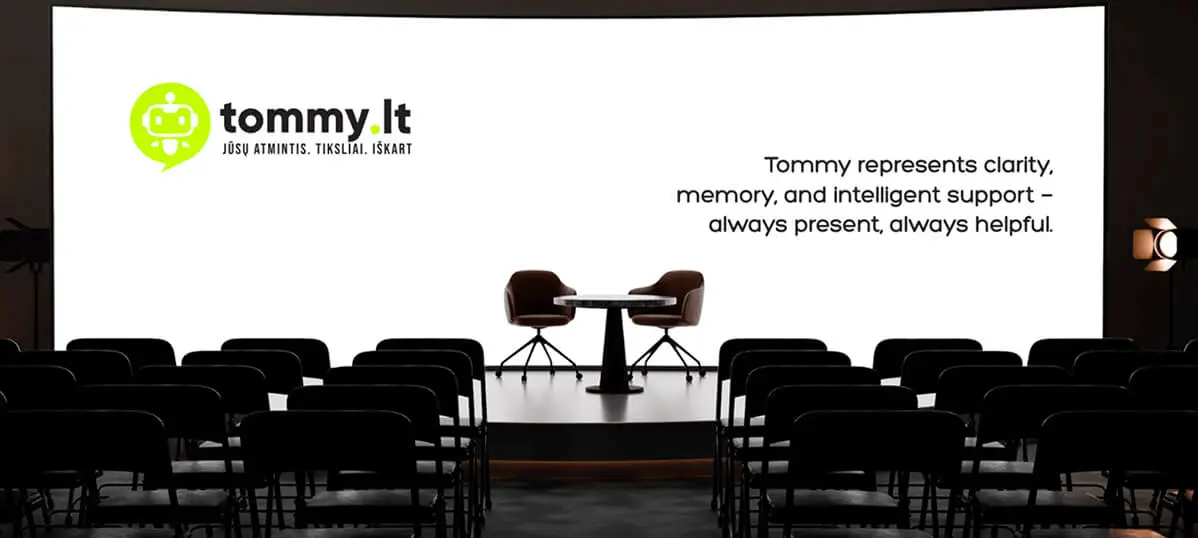
Tommy represents clarity, memory, and intelligent support — always present, always helpful.
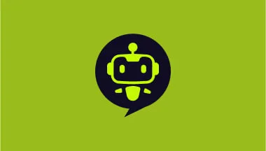
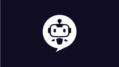
The Tommy.lt logo features a bold, modern wordmark paired with a distinctive icon that embodies the brand’s identity — approachable, intelligent, and helpful. The color palette is intentionally minimal, with a high-contrast combination of Bright Lime Green (#C6FF00) and Dark Navy/Black (#100C24), symbolizing clarity, innovation, and trust.
The icon represents Tommy, the AI assistant, in the form of a stylized robot face inside a chat bubble. This fusion of elements reflects Tommy’s essence:
To ensure the Tommy.lt logo remains clear, legible, and visually impactful across all mediums, a consistent clear space must be maintained around the logo. This space protects the logo from visual clutter and ensures it stands out in any layout.
❌ Do Not
Tommy.lt is an AI-powered assistant designed to support both work and family life with intelligent memory, seamless search, and secure collaboration. Built with clarity, trust, and simplicity in mind, Tommy helps users manage files, emails, and information in one private, organized space — so nothing gets lost, and everything is just a message away.
Clarity
Tommy is built to make life simpler. From its clean design to its precise AI responses, clarity is at the heart of every interaction.
Trust
Tommy is built to make life simpler. From its clean design to its precise AI responses, clarity is at the heart of every interaction.
Helpfulness
Whether you’re working on a project or managing family tasks, Tommy is there to support you — like a memory that never fades.
Simplicity
No clutter, no friction. Tommy’s interface and features are designed to be intuitive, minimal, and easy to use for all.
Empathetic Intelligence
Tommy is more than just smart — it’s considerate. The assistant learns your patterns, adapts to your needs, and communicates in a natural, friendly way.
Innovation
As part of SEAL Group’s forward-thinking ecosystem, Tommy constantly evolves — embracing new technologies to deliver smarter, more seamless support.
The Tommy.lt color palette reflects the brand’s modern, tech-forward identity while staying friendly and energetic. The contrast between vibrant lime and deep navy-black ensures strong visibility, accessibility, and emotional balance.
Bright Lime Green
Primary color
Buttons, highlights, icons, accent backgrounds
Dark Navy / Black
Supporting color
Buttons, highlights, icons, accent backgrounds
Deep Ocean Green
Background Color
Always pair with white text (#FFFFFF) for maximum contrast and readability on dark backgrounds.
To enhance visual energy and create a smooth, modern look, Tommy.lt uses a vibrant lime-toned gradient. This gradient is ideal for call-to-action buttons, section backgrounds, icon fills, and hover states.
Color Stops:
This gradient complements the primary #C6FF00 tone while adding depth and a dynamic feel. It should be used sparingly to emphasize key elements without overwhelming the minimalist aesthetic.
Tommy.lt uses the Poppins typeface — a modern, geometric sans-serif font that aligns perfectly with the brand’s minimalist and tech-savvy identity. Its clean curves and balanced proportions offer excellent readability across devices while maintaining a friendly and confident tone.
Poppins is chosen for its:
| Element | Font Size | Weight | Line Height | Use Case |
|---|---|---|---|---|
| H1 | 52px | Bold | 120% | Hero headlines, main titles |
| H2 | 36px | Bold | 120% | Section headings |
| H3 | 30px | Bold | 120% | Subsection titles, feature intros |
| H4 | 24px | Bold | 125% | Smaller headers, secondary blocks |
| H5 | 20px | Bold | 130% | UI panels, settings headers |
| H6 | 18px | SemiBold | 130% | Captions, tooltips, tertiary labels |
| P | 18px | Regular | 150% | Body text, descriptions, interface copy |
The imagery used in Tommy.lt communications should reflect the dual nature of the product: intelligent AI technology and genuine human connection. The visuals should strike a balance between smart digital tools and real-life warmth.
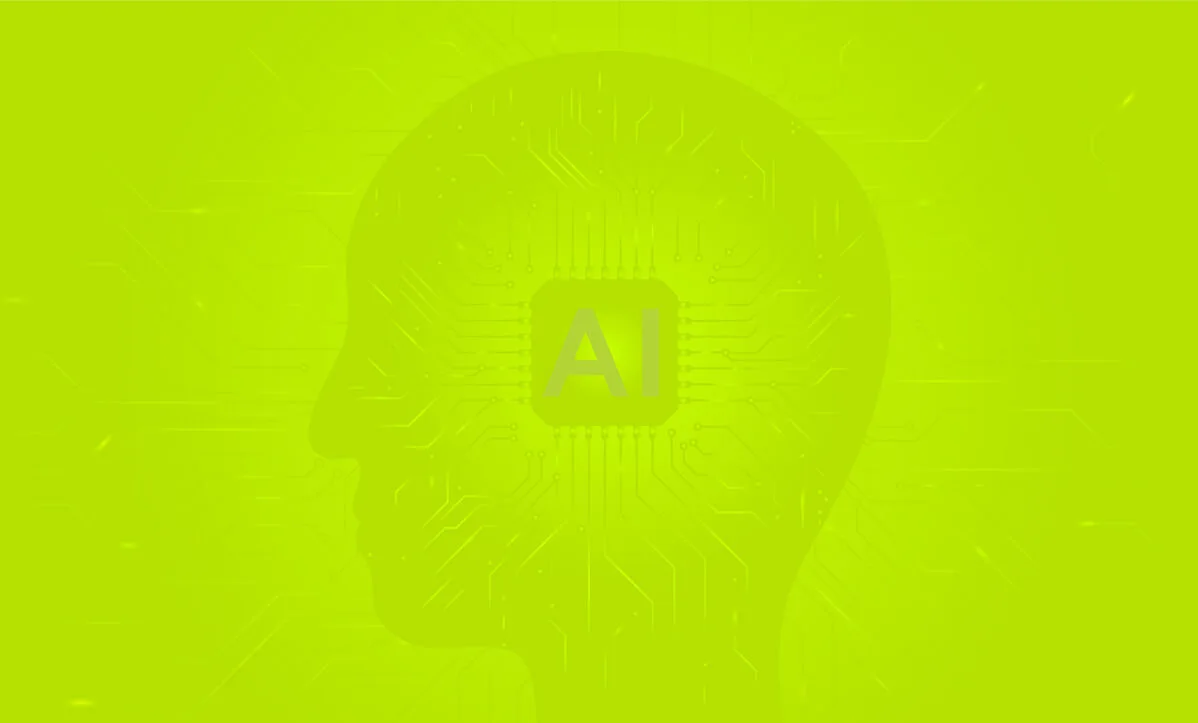
AI Visuals: Use sleek, minimal illustrations or 3D visuals of friendly robots to represent the AI assistant. Avoid overly technical or cold imagery — Tommy should feel helpful and approachable.
Family Use: Include authentic, high-quality images of families interacting naturally — ideally working or planning together around a laptop or tablet, suggesting Tommy’s usefulness in both home and professional life.

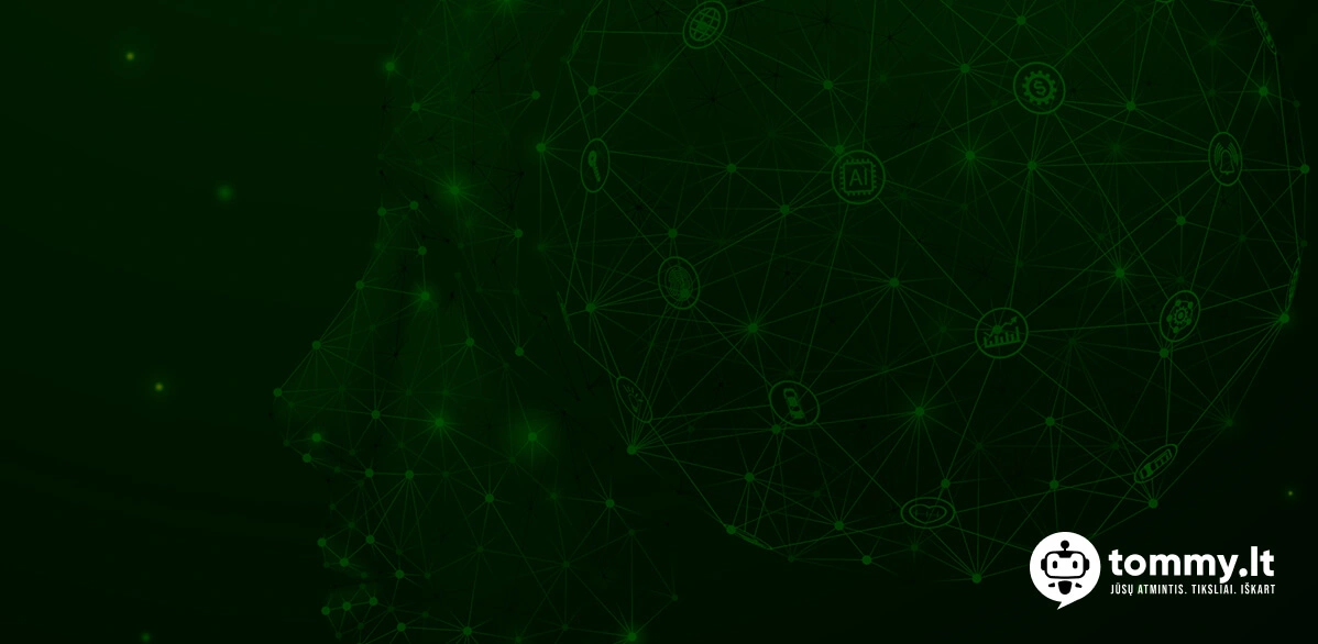
Human-Centered Scenes
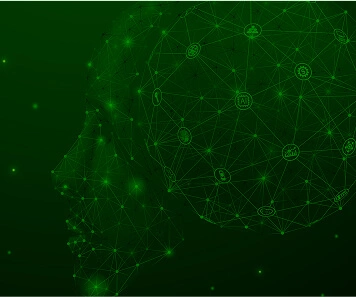
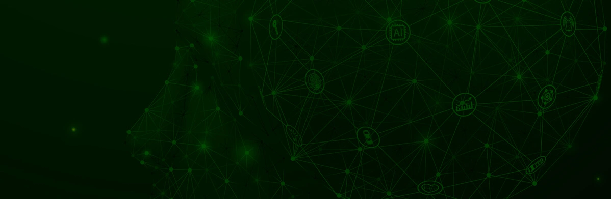
Abstract Neural & AI Graphics
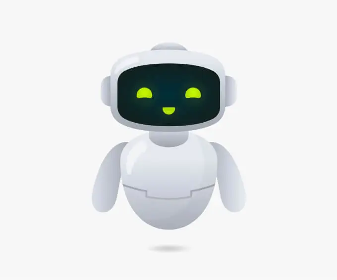
Friendly AI Visuals
Icons play a key role in enhancing clarity and navigation throughout the Tommy.lt interface and communications. The icon style should reflect simplicity, intelligence, and friendliness, just like the assistant itself.
Recommended Style
Structure, Balance, and Clarity
Our layout system is built on clarity, consistency, and ease of use. It ensures that every interface — from landing pages to in-app UI — remains intuitive, structured, and visually aligned across all devices.
Grid System
Page margins
Intelligent. Supportive. Effortless.
Tommy.lt speaks like your most capable assistant — clear, concise, and always helpful. The tone blends the precision of artificial intelligence with the empathy of a real human helper.
✅ “Let me help you find that file.”
✅ “Here’s a quick summary of your meeting notes.”
✅ “Would you like to organize this by topic?”
❌ “I do not understand.”
❌ “Error. Try again.”
❌ “This action is not allowed.”
Tommy.lt communicates with clarity, warmth, and purpose. Every message should feel like it’s coming from a capable assistant who’s always one step ahead — professional, but never cold; helpful, but never overwhelming.
Clear & Concise
Get to the point quickly. Avoid jargon, keep messages short, and focus on helping the user complete their task effortlessly.
Helpful & Action-Oriented
Guide users with positive, actionable steps. Anticipate needs and suggest the next logical move.
Human & Reassuring
Even as an AI, Tommy should feel relatable. Use polite, empathetic language — especially when things go wrong.
Consistent Voice Across Touchpoints
Whether it’s in the landing page copy, app UI, notifications, or emails — maintain the same tone and clarity.
Onboarding & Welcome
Upload & File Management
Search & Retrieval
Writing Tips
Maintaining a consistent and high-quality brand experience requires careful attention to how Tommy.lt is represented. These guidelines will help designers, developers, and content creators stay on-brand — every time.
Do:
✅ Use the official logo with proper clear space and approved color versions
✅ Follow the color palette: Bright Lime Green (#C6FF00), Dark Navy (#100C24), and gradient rules
✅ Use brand typography consistently — Poppins font, with defined sizes and weights
✅ Maintain a human-friendly tone: clear, supportive, intelligent
✅ Apply consistent iconography: outlined, clean, modern
✅ Use approved imagery: families at laptops, AI-inspired visuals, and abstract neural-style backgrounds
✅ Respect spacing and layout rules for balance, clarity, and mobile responsiveness
✅ Keep messaging focused on usefulness, trust, and simplicity
Don't:
❌ Stretch, distort, or recolor the logo
❌ Use unapproved fonts or inconsistent text sizes
❌ Crowd elements too closely — respect white space and padding
❌ Use stocky, cliché AI images (e.g., generic robot faces or binary code visuals)
❌ Overcomplicate the tone with tech jargon or robotic language
❌ Mix color tones outside the approved palette or gradient range
❌ Write vague or impersonal messages
❌ Break visual hierarchy — headings should be clearly defined and structured
The tone of Tommy.lt’s user interface reflects the brand’s core: intelligent, supportive, and human-centered. Every message, button, and label should help users feel confident, understood, and in control.
Clear & Helpful
Speak plainly. Always aim to simplify, not overwhelm.
Example: “Start a new workspace” instead of “Initiate a session.”
Friendly & Supportive
Be warm without being casual. Professional, yet approachable.
Example: “Let’s find that file together” instead of “Searching…”
Efficient & Intelligent
Show confidence and competence. Communicate like a smart assistant — precise, yet never cold.
Example: “Here’s a summary of what matters most.”
Reassuring & Respectful
Especially in areas related to privacy, file access, or errors, keep the tone calm and reassuring.
Example: “Only you and your team can see this.”
To position Tommy.lt effectively across search engines (SEO) and AI-driven assistants (AEO), our content must be structured, relevant, and human-centered. Optimization should never compromise clarity or user experience.
SEO Best Practices
Use clear, concise page titles
Example: “Tommy.lt – AI Assistant for Work & Family Organization”
Use H1–H6 hierarchies properly
Only one H1 per page.
Subheadings should follow semantic order.
Meta descriptions informative
Keep under 160 characters. Highlight core benefits.
Alt text for all images
Descriptive, relevant, and helpful for both accessibility and indexing.
Clean URL structure
Use lowercase, hyphen-separated words. Example: www.tommy.lt/features/ai-summary
Fast page load
Critical for both SEO and user retention.
Tommy.lt’s social media presence serves to educate, engage, and build trust with users through clear, relatable content about AI-powered productivity and everyday utility — always with a friendly and intelligent tone.
Consistent Tone
Maintain a clear, supportive, and intelligent voice across all posts.
Tone: Smart, clear, supportive, friendly
Educational Micro-Content
Share quick tips, feature highlights, and “Did you know?” posts to show how Tommy helps daily.
Direct CTAs
Always link back to chat.tommy.lt with action buttons like “Try Tommy,” “Ask Tommy,” or “Chat Now.”
Visual Identity Unity
Use brand colors (#C6FF00, #100C24), minimalist design, and approved typography (Poppins) in every post.
Platform-Specific Content
Tailor visuals and messages to Instagram (visual/lifestyle), LinkedIn (professional/use case), and optional Facebook (community/local).
Storytelling with Use Cases
Highlight real-life scenarios — a team lead finding notes, a parent organizing files — to humanize the AI.
Primary Channels
Visual storytelling: product animations, daily tips, carousel explainers, lifestyle imagery with families, home offices, etc.
Professional positioning: productivity use cases, industry news, team updates, partnerships, and AI insights.
Community building: localized posts, contests, testimonials, support updates.
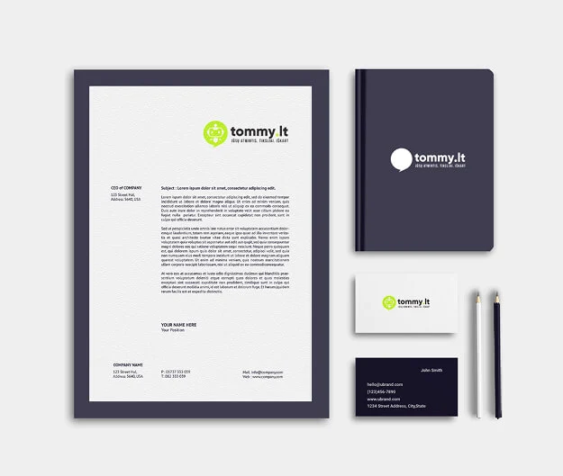
Tommy.lt’s identity extends beyond the digital experience — it lives in print, merchandise, email communication, and advertising. To maintain a consistent, professional, and recognizable presence, all applications of the brand must follow these core guidelines.
This section outlines how the Tommy.lt visual and verbal identity should be applied across various touchpoints, ensuring every interaction — from business cards to video ads — reflects our values of intelligence, empathy, and trust.
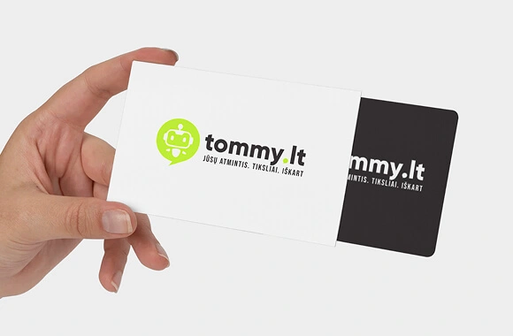
Business Cards
Front: Logo, name, title, contact Back: Slogan or key benefit (e.g., “Your AI Assistant. At Work. At Home.”) Colors: Background in #100C24 with lime accents
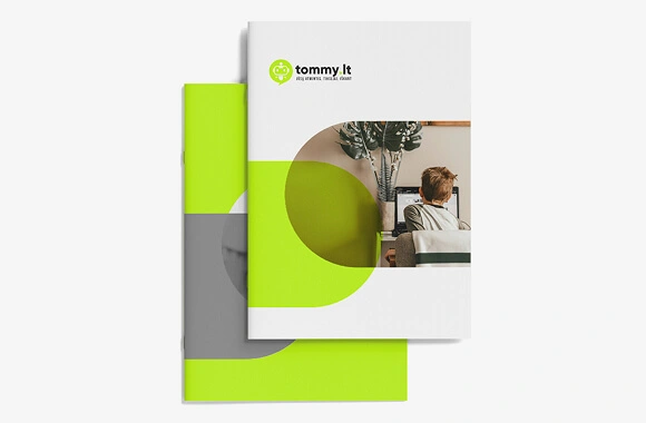
Brochures & Flyers
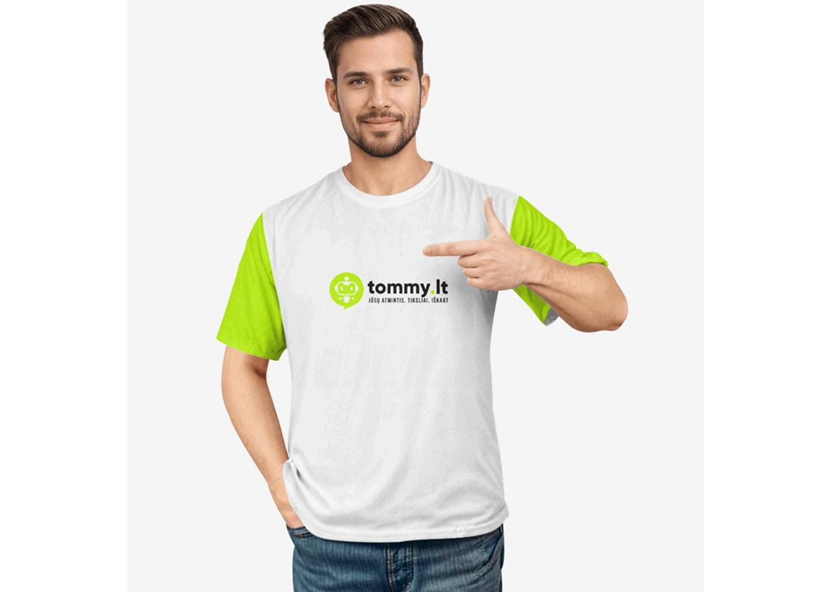
Use brand typography (Poppins), primary color accents (#C6FF00), and minimalist layouts. Include iconography and friendly visuals (e.g., family with laptop or robot).
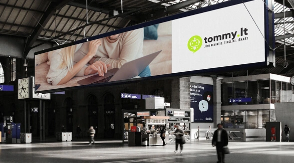
Banners (Print/Exhibitions)
Large, bold headlines (Poppins Bold, 52px+), gradient use (#E3FF84 → #C2FA01), clean spacing. Feature key features or CTA: “Try Tommy at chat.tommy.lt”
Every communication should feel clean, branded, and professional.
Email Signatures
Document Formatting Rules
Video Content
Ad Creatives
Sponsorships & Partnerships